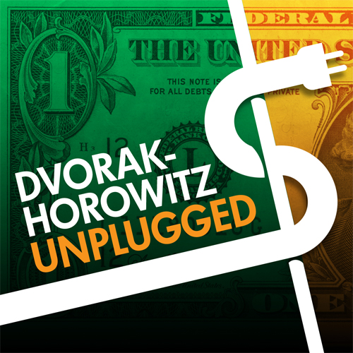
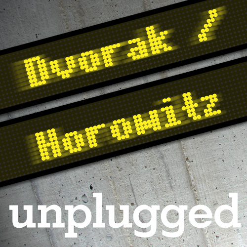
Yes, I have bit the bullet and now crowd (mob) source things like this. Why not? Add a comment telling which design you like best. If you are reading this from Twitter, use that and just send me a number 1, 2 or 3. Thanks!
1.

2.

3.


# 2 is my vote
3
I’ll vote for #1 as it matches some of the sound effects in John’s library.
You know you’re going to get the one with the hole in the head, right?
they all aren’t great, 2 is the least bad. I’ll do something way nicer if you pay me a little 😉
I love #1, very clever!
#3
2
i like #2
2
Follow this link to view submission No.4 plus a $100 surprise! http://gallery.me.com/pweisz#100221
#2
3
#2 however #1 would be best without the holes.
I like 2
but 1 does have your faces in it. That is important so….
I’d still pick #2 first with #1 as an alternate.
I like #2 the best.
Of course #2, since
#1 is a joke – specially the wholes, and
#3 is to ugly.
2 looks the best.
3 would last longer.