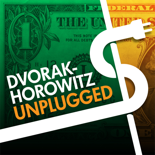
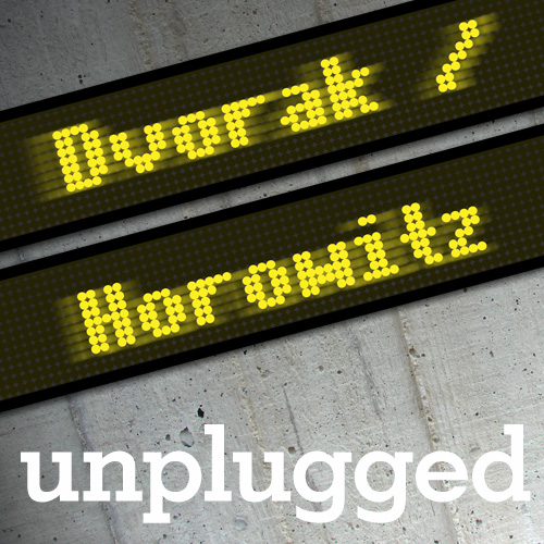
Yes, I have bit the bullet and now crowd (mob) source things like this. Why not? Add a comment telling which design you like best. If you are reading this from Twitter, use that and just send me a number 1, 2 or 3. Thanks!
1.

2.

3.


2 looks good, but I like the concept around 3. Granted, the tickers should be unplugged …
My vote goes for #3
2
#2
What’s with #2. It looks like a couple of dudes from India.
I like 3, then 2, not 1 so much. Thanks for asking.
#2
#2
2
2
No. 1 is the best
I like number 1
#2 is very good and professional looking
Number 1 is clearly superior.
I like #1!
#1
#2
Two
#2
#2 is my favorite.
#3
#1 so you both don’t look like number 2.
#2
#2 for sure
3
number 2
Number #4.
OK, I don’t know what it looks like but it almost has to be preferable.
#2
Whichever one most represents the topics discussed: Stock market, investments, economic trends, humor. Frankly, I think you need some more nominees but the last one, #3, though rather plain, says what it’s about most to me.
3.
#1