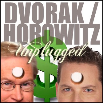
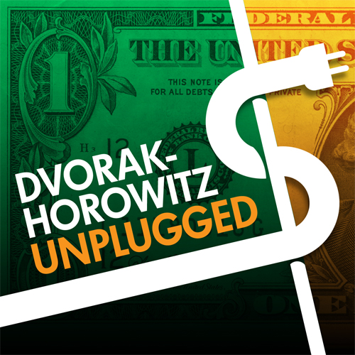
Yes, I have bit the bullet and now crowd (mob) source things like this. Why not? Add a comment telling which design you like best. If you are reading this from Twitter, use that and just send me a number 1, 2 or 3. Thanks!
1.

2.

3.


My first reaction was in liking #2 best. Then I thought that the order 1, 2, 3 was from best to worse. But judging from all the 2s, I guess that my initial reaction was probably correct.
#2
2
#2: Nicely clean graphic.
I hate to go with the mob but:
#2
It’s clean, clear but actually has some detail.
1 is to busy and 3 is to bland.
#2 is the safe, go with the flow choice…boring! #1 will do just fine!
2
2
#2
#2
1
#2
I like both #2 and #3, though #2 looks more professional. #3 has more of a “hacker” feel to it.
#2
They’re all crap. Just post the iTunes link. Number 3 should just shorten your names to something that looks like a real stock name.
Maybe: dvrk & hrwtz or something. Number one has some humour, but it’s still crappy.
Number 2 is still a bit complicated, but it would work fine. Please don’t use number 1 – it makes me queasy!
I think the best graphic would be Dvorak and Horowitz dressed like WWF wrestlers holding the title belt while standing over a conquered Barney Frank!
Or maybe #2.
#2
# 2 gets my vote. Number three is too plain and number one…Makes me think of “I need this podcast like a hole in the head.” I don’t like cover art that says your just a couple of goofs.
Number 2
2
#2. I like the dollar sign made from the plug and cord. It’s graphically pleasing and clever considering the topic and title of the podcast.
No 2. No question.
#3
lOKS AS IF #2 IS GOING TO WIN…
2
#1
#2 for the win! John P. Skvorak
Nummer två!
Take those things off your foreheads and make it 1.