
Yes, I have bit the bullet and now crowd (mob) source things like this. Why not? Add a comment telling which design you like best. If you are reading this from Twitter, use that and just send me a number 1, 2 or 3. Thanks!
1.

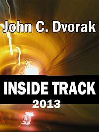
2.

3.


#2
1 is my vote..
I feel like they all have bad, corny concepts and terrible type design. Your content is so great. Why wouldn’t you have design that reflects that value.
Great type design: http://www.pelavin.com/
Worked with him before. Can’t say enough good things.
I always knew you must have a hole in your Head
#1
I like #3.
2
2
#1 would make the best Itunes cover art. Yes #2 is the best looking, but you need to tell a little about who is on the show. #1 shows personality and a mix of humor.
#2 rocks!
P.S. You might want to consider a poll widget next time 🙂
#2
3, the rest are a little clichéd.
2
#2 Works best.
#2 or #3 and I prefer #3.
2!
Definitely #2
#2. The rest are crap.
Version 3 is my favorite.
#2 seems the most professional.
#3 for me – (2 is nice, but I’m ‘not buying’ the ‘S’ plug/cord deal…)
2 is best, 3 is okay. I don’t like 1 at all, I am not fond of heads with holes.
#2 except use a $100 bill, Dvorak looks kind of like Franklin.
3
#2 no question, it’s nice and professional looking.
I think 1 is nice. The bullet holes are a nice effect.
#2
#1
#2
It seems more professional looking than the other two.
on a side note, Good luck with that !
I vote #2
#1, with LASER and red dots..NOT holes..