
Yes, I have bit the bullet and now crowd (mob) source things like this. Why not? Add a comment telling which design you like best. If you are reading this from Twitter, use that and just send me a number 1, 2 or 3. Thanks!
1.

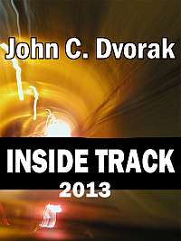
2.

3.


My vote goes to #2
#2 is the best
2
#2 is the clearest
number 2!
#2
2
It is probably the most eyecatching
In my opinion #2 is the best and #3 is the next best. I don’t really like #1.
#3, please. It’s the classiest and best expresses your theme.
I like #2!
#2
#2
I’m liking #2 as well. However, the color scheme hints at a latent U of Miami Hurricanes fascination.
2 fo sho.
#2
#2
Definitely going to have to go with #2. It just seems more in your face, not to mention it has some great design work.
Fill in the holes in your heads and number one would be ok.
#2
#2 should show up the best as album art.
#2… #1 is just creepy
I really like number 2 it has the unplugged power cord and the money in the background its a logo that won’t make tired after becoming familiar with it. number 1 is a good effort but it’s too silly with the pictures and the holes and the overused dollar sign in everything to do with money. number 3 is just plain hideous.
#2 no doubt about it. It communicates the topic, it’s clear, simple… perfection.
#2
#2
I vote for #2
I would go with number 2.
#2
2 is the best
four!