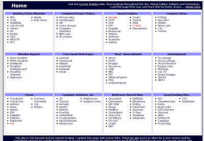
As many of you know I solicited a redesign of the dvorak.org/home.htm page.
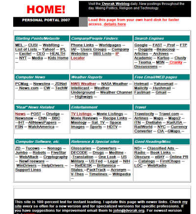
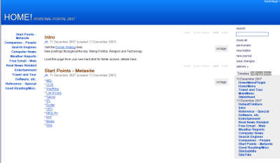
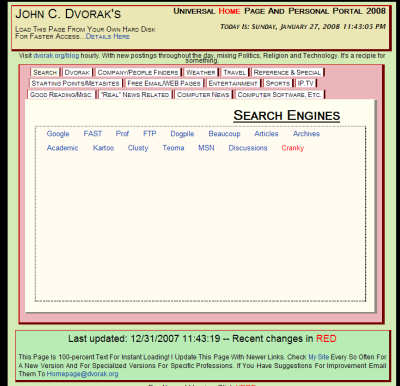
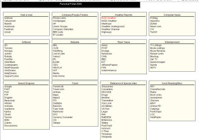
OK… I took the top 5 Homepages submitted and gave them each a page for users to choose as their favorite. I have my favorite already and I just need confirmation. I received 15 entries and some were just not different enough from the original and others just missed the mark for other reasons. The total code size is an issue. Tell me what you think in the comments.




Joe Radman but he just beat Paul Stewart out by a nose hair
I must be getting old, None of these new designs look as good as what’s being used already. Change for the sake of change, Reminds me of Vista!
Thanks for all of the comments! It was fun to have a horse in the race.
@#96 Agreed!
It was really great to be up against such a talented group. Thanks to John, Joe, Jeff, Paul, and Wan Khairil for a fun contest!
It has been a Lot of fun! The comments are really sweet, there is such a nice family friendly crowd around here. ;}
I really like putting my stuff up with other entries. You guys are making this interesting, Thanks,
It would be cool to hear the ideas that lead to the designs. Hey maybe we can take it to a Cage Match, and really get the crowd howling? Ah where the fun never ends…
I think Paul Stewart’s is by far the most interesting. I LOVE the colours…it shows a bit of creativity.
Out of the five, I find Jared Cordasco’s design is the most usable of the bunch for me. I also like the style of Joe Radman’s (nice use of color), but I prefer to have all the links left-aligned rather than inline, as it is easier for the eye to follow. A mash-up of the two would, for me, be ideal. Good work, guys!
Too little, too late: had I known, I would have submitted one myself. *sigh*
Cordasco’s #1
Reza 2
Hirichs’s doesn’t render properly in Firefox
Jared Cordasco’s is the best. Nice and clean. Like others have said, maybe change the color to red to fit the theme of the site. Otherwise excellent.
These are the best 5? I vote you don’t muck with it then.
Paul Stewart gets my vote
Joe Radman’s entry absolutely gets my vote hands-down.
It’s clean, nice looking, doesn’t require any extra clicks… brilliant!
Regardless of whether or not it’s picked, I’ve saved it and it is my new home page.
Hey, you know, I’ll vote for my own.
I’m voting for Paul Stewart. Wish you luck Paul.
is there a winner yet?