As many of you know I solicited a redesign of the dvorak.org/home.htm page.
OK… I took the top 5 Homepages submitted and gave them each a page for users to choose as their favorite. I have my favorite already and I just need confirmation. I received 15 entries and some were just not different enough from the original and others just missed the mark for other reasons. The total code size is an issue. Tell me what you think in the comments.

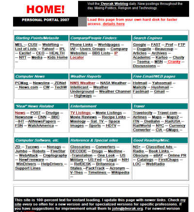
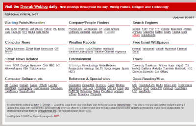
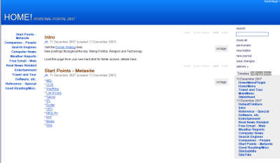
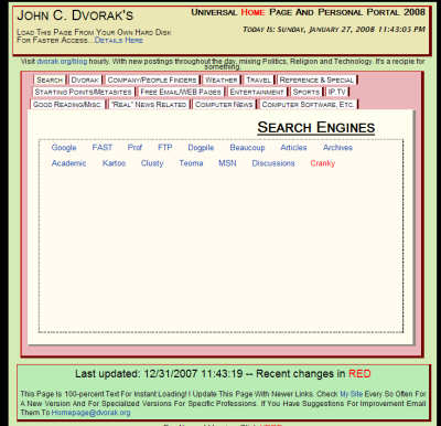
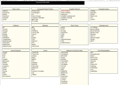
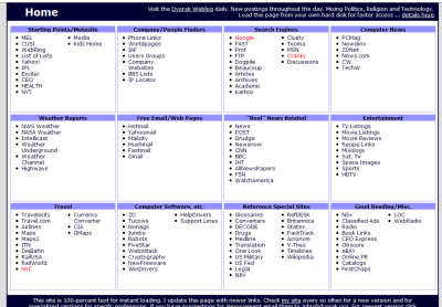



Joe Radman one is my fav.
Let me make this further comment.
Both Jared Cordasco Entry & Joe Radman Entry are the closest to what was asked for but I think Jardes Cordasco went with the better choice of vertical bulleted links which design wise are much easier to locate than the horizontal layout that Jow Radman went with
I like the idea of a contest, but those all suck.
Does the world need yet another web portal?
I vote you continue doing what you do best, bitch and moan in the blog and leave the portal business to the other 10,000 people doing it already.
My vote:
First Choice: Jeff Hirichs
Second choice: Paul Stewart
They both significantly ease finding what you want quickly instead of having to look around. I believe that they will be better for future expansion because not all the information absolutely has to appear on the front page. Thanks!
Sorry I hate pages like that. Does the world need yet another web portal?
I vote you continue doing what you do best, bitch and moan in the blog and leave the one stop web directory business to the other 10,000 people doing it already.
To be honest they are all bad. They look like those “fake” search engine sites with all the links that are just based on getting “click money”. Thats just insulting.
A homepage should contain all things Dvorak. For example: I listened to a podcast of the No Agenda show and liked it. I want to know where I can find a list of ALL media that Dvorak puts out. A homepage of links to media and articles like Tech5, CrankyGeeks, No Agenda, PC World, etc. What Dvorak media am I missing out on?
You could also make it easy to get the media and RSS by offering sub-links that allow mp3 downloads of the poscasts without having to search 6 click levels for them.
Simple outline format. Stop reinventing the square wheel.
I like Joe Radman’s entry, followed by Paul Stewart’s.
Howard
I really like the one by Jared Cordasco.
None of these entries are any good. I am disappointed. These all look like 1990’s class designs.
Radman or Cordasco just because they are simple, no javascript, and clean. loads up fast which is what you want.
As for what Male Muse said…yes from the 90’s cause a link page looks like that. dont need web2.0 for my home page. and I think John is like that as well…something quick and fast that gets the job done.
I vote for Joe Radman’s Entry
Radman
Yuck. None of the above.
Radman.
I’ve never seen the home page before. Never knew it existed. I doubt if I’ll ever be back. Love the blog!
I’ve never been to John’s homepage, and purposely did not look at earlier comments, so what follows is (possibly loony, but completely) objective.
I like the original / current design. It has an energy and immediacy.
John, are you kidding me?
Polls, and votes?
How am I going to look up to you for leadership, if you are just going to ask me what it is that I want?
You do it your way, John.
BTW, I like it now, and think that the choices (?) offered as alternatives SUCK!!!!
May as well go w/ rust on black web 2-point-dick layout, if you don’t want people that pay $50/mo. for high speed DSL to read your blog and hear your voice.
We’re all grownups, lets discuss the news and current events, and marvel together at the stupidity of the crowd mind. (Sorry Digg.com)
Stay good, stay right.
I remain,
YARR
Jared Cordasco’s entry is my fave. Simple, like your old one, yet with better layout. Followed closly by Joe Radman’s. I don’t like all the tabs of Paul Stewart’s entry, Jeff Hirich’s entry is a little confusing to a new visitor.
At first I really liked Wan Khairil Reza’s entry, the way it would center and enlarge on mouseover, until I noticed this made links fly south off the page. Needless mousework for that.
That’s my 2 cents.
Paul Stewart is best concept but page still doesn’t work as it should – I tried with IE7 and Mozzila there are some problems with navigation
I like the last one by Jared.
Radman entry looks good
I find the Cordasco entry easiest to read but it may be size change unfriendly, note one ‘Reference Sites’ item outside the bottom of its box at 1024×768 resolution (Firefox).
If you really want the maximum possible number of directly accessible entries then the Radman entry is cleanest and closest to the original, but busy.
I like Paul Stewart’s. It is informative yet not cluttered. The tabs offer a greater amount of flexibility. I am not a fan of the coloring though.
Joe Radman gets my vote, for the same reasons outlined in most of the many posts favoring his entry.
I like Jared Cordasco’s entry.
I like the Tom Cruise entry. I like the rambling, incoherent design with the outer space look.
Joe Radman’s is the best, in my opinion. However, none of them are actually great.
I vote for Joe Radman’s
Joe Radman’s by a neck. Paul Stewart has a nice concept, but DAMN that’s some ugly graphic design.