As many of you know I solicited a redesign of the dvorak.org/home.htm page.
OK… I took the top 5 Homepages submitted and gave them each a page for users to choose as their favorite. I have my favorite already and I just need confirmation. I received 15 entries and some were just not different enough from the original and others just missed the mark for other reasons. The total code size is an issue. Tell me what you think in the comments.

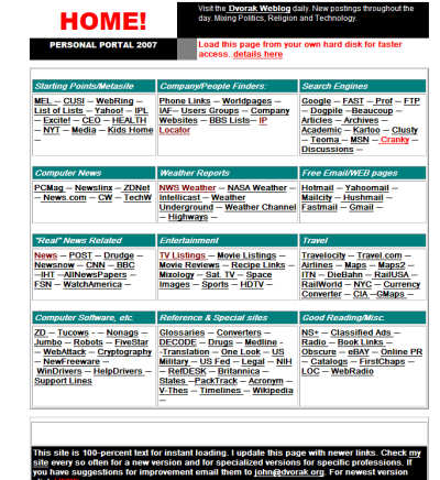

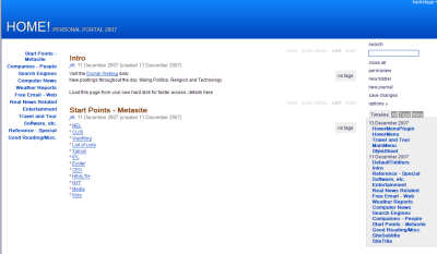
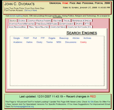
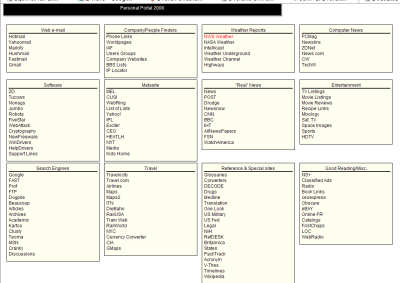
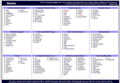


Joe Radman
Jared Cordasco
I don’t care for any of them. Even with the existing design I often have to use ReadEasily to disable styles so my old eyes can separate the content from the fluff.
I’d vote for #1. Mind if I try a design, John C. Dvorak?
Actually, I prefer the current homepage, with Radman’s page as a distant second place.
Radman
NONE!
The setup you got now works fine, and it’s prettier than the examples shown. Just needs some organizing on the links at the left pane (the one with the slideshows, crankygeeks, etc.). That section needs more notoriety. Maybe a horizontal tabbed setup at the top. Like all major sites, it’s usually like so. A sort of Dvorak’s world.
I would also make the “dvorak uncensored” jpg a full color heading (like the blue example).
Also make things easier to reformat for wide screens, as these start to come up in big numbers.
Sorry I completely blew it. I was thinking the BLOG page, not the HOME page…
My earlier comment is for the BLOG page, still I back everything I said.
As for the home page, don’t bother as nobody sees it…
but anyway: Radman
I kinda like the one we already have. Why change?
Hirich’s.
I like Joe Radman’s except for the red. I also like the tabbed interface of Paul Stewart’s but the colors need to be changed.
#5 – I like the list look compare to the #1’s sentence look.
I would go for the clean look of Jared Cordasco Entry number 5.
Wan Khairil Reza’s page ia my vote – The mouse over is great to focus on that section and click what you want.
Cheers
I am voting for the last one … Jared Cordasco. It is nice, clean and a pleasing color.
No pictures? If that’s the way it has to be then there shouldn’t have to be any scrolling; therefore, I vote for Radman-with Hirich’s colors and title bar.
I think it would help if we didn’t have to click on one of those to get the newest blog posts. Right now, I don’t see anything newer than this post on the main page.
UGHHHH.
Start the contest over. And hang some cash out there to get some talent to step up.
None is significantly better than the original… May I suggest John get netvibes.com account and customize it. Some of requirements wouldn’t be met but the additional features would be worth it.
Jeff’s the best in my opinion…your current site is too busy!! It is an eye sore to look at! Everyone else tries to ‘duplicate’ it somehow but Jeff really cleans it up..it would be a nice change in my opinion.
All are terrible.
Stop being cheap and hire a professional designer.
I like Joe’s entry the best, but Jared’s ain’t too shabby.
MikeW. Yeah? Who? A couple of entries are from professionals. And the key here is loading time more than design. An out-and-out hot design would negate the rationale for the homepage.
None of them really break any new ground. Can’t say any really are a major improvement over the original. The tabs are nice but why use them if everything will fit on a single page? Number 1 would be my choice if I hadta pick one. Otherwise, I’d say stick with what ya got. It works just fine.
As my Pappy used to say, if it ain’t broke, work on it some more…
None of them really break any new ground. Can’t say any really are a major improvement over the original. The tabs are nice but why use them if everything will fit on a single page? Number 1 would be my choice if I hadta pick one. Otherwise, I’d say stick with what ya got. It works just fine.
As my Pappy used to say, if it ain’t broke, just work on it a little more…
Joe Radman’s is the best. However, they all still make me feel like it’s 1997. 🙂
It’s a toss-up between Joe and Jared, but I’m leaning toward Jared’s clean look.
I agree with #19. New isn’t always better. And your current is better than these.
I would go with Jared Cordasco Entry. It seems to have everything you spoke of.
BTW Mr. Dvorak may I say you are begining to look more and more like Drew Carey as time goes on. 🙂
I liked Paul Stewart’s.