
As many of you know I solicited a redesign of the dvorak.org/home.htm page.
OK… I took the top 5 Homepages submitted and gave them each a page for users to choose as their favorite. I have my favorite already and I just need confirmation. I received 15 entries and some were just not different enough from the original and others just missed the mark for other reasons. The total code size is an issue. Tell me what you think in the comments.
CLICK ON PIC FOR LINK TO ACTUAL WORKING PAGE
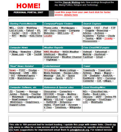
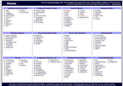
Original
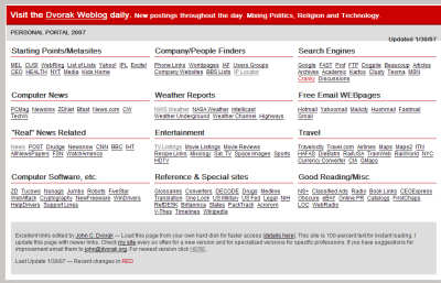
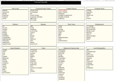
Joe Radman Entry
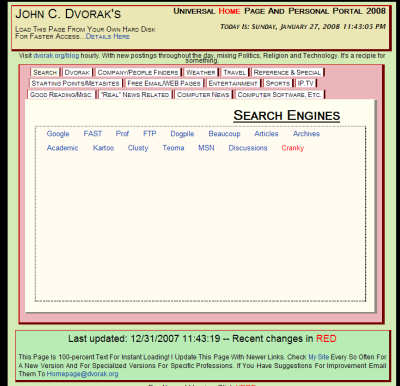
Jeff Hirichs Entry
Paul Stewart Entry
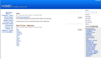
Wan Khairil Reza Entry
Jared Cordasco Entry


I’m voting for the Joe Radman Entry.
I vote for Paul Stewart entry. It presents a new and different style and seems to be easier to find items with the tabbed folders. Maybe the colours could be more artistic.
#5 (the bottom one) is outstanding, except it has too much whitespace padding at the bottom of each table cell and needlessly needs to scroll for no good reason.
Joe Radman. Simple, clean, gets to the point without annoying clutter or gratuitous interaction. Also, resizes well.
Add: the top one isn’t bad either.
All of them are very innovative, but #1 and #5 have all the links on a single page and require less clicking to get to the site.
#4 causes the table row width and height to change on mouseovers.
Sorry for yet my 3rd reply, but I have to say hats off to John Dvorak for doing this competition.
These entries are all VERY high quality and I think #1 (John Radman’s) is almost the pinnacle of a concise, well organized and fast reference page.
I like Radman. Totally Loads on One page. Easy on the eyes. No reason for tabs if all the info can be displayed at once.
The change in color as the mouse moves over it is “catchy” but wears thin–and page doesn’t fully display.
A vote for Joe Radman Entry. By a mile.
Including the original.
Maybe not a red top though.
Radman all the way.. Hirichs reminds me of share point…. So it loses me right away. 😉
I like Paul Stewart’s the best, except not the colors (the pink has got to go!) It really gives you room to add a lot more to each section, if that is something you wanted to do.
PAUL STEWARTs I’m a big tab view fan. less initial clutter.
vote for #6 Jared Cordasco (clean and simple)
sorry but please:
no moving targets please #5
no mostly empty tabs #4 (or extra click required)
no java script #3
Hands down, 1st entry, Joe Radman. George Washington says that’s your choice too.
I can’t decide between Joe Radman and Jared Cordasco’s. So i vote for both. If i had to pick only one i’d pick Joe’s, just ’cause.
M
Seriously, they’re all eyesores, but the Radman one is the least obnoxious.
can we please go back to web 1.0
or at least let us look at all 15..
why is everything a template these days?!? I don’t see any of the 5 choices being significantly better than the preset version.
I vote for the Jared Cordasco Entry as the easiest to read.
is this change for changes sake?
but anyways.. i’ll vote for radman.. so far
team him up with jared and see what they come up with
i hate to say it John,
but i don’t give any a vote. your current site looks more unique than any of those..save maybe paul stewarts..
they all look like those boilerplate search engine websites you see when you jump to a domain that has expired and some domain parking louse has snatched up.
sorry john, no vote here.
i dont see where your news clips fit on any of them. -Maybe paul stewart’s entry… tabs are always hip and easy to navigate..
the rest of them would make me think i’d landed on a parked domain for which i’d instantly add to my 17,000+ site HOSTS file for ad/domain blocking..very boring.
(tho fast loading, all text would be my next vote. -you should make your site so it loads fast on a PDA with no formatting issues..just a thought.)
my 2¢
-soundwash
They’re all pretty bleak, but the Radman’s the cleanest and least painful on the eyes, for what it’s worth.
Whats’s the point to this again? Just how slow is your internet connection that you need this to load that fast?
I like Reza’s. Reminds me of http://www.youtube.com/watch?v=w1FeEezee4s
I don’t like any of them. They don’t grab my attention like pictures and, to a smaller degree, bold text do now.
The Joe Radman entry by far. Simple, small, fast. And let’s face it, with a page full of links, there’s only going to be so much you can do with a wall of text links.
Joe Radman
Jared Cordasco’s entry is the best one. Clean, uncluttered and easy to read and does not stray too far from the original. They are all good but his is the best.
Radman, no doubt. Clean, easy to read. Color scheme is soft and easy on the eyes. SOme of the others are a little more ‘link farm’ like.
I hope your favorite is not one of the five shown here. 🙂
John,
I understand your desire to modernize the look of the page. However, look at the lineup and compare to the original. Which is easiest to read and quickest to use?
My call is the original. Sure, jazz up the top banner into something supercool. But why burn up energy on changes that won’t seem improvements to the users?
I feel your pain. I’m trying to redesign my three sites as well. It ain’t as simple as it looks, but the editor/publisher is beholding to the visitors, right?
To be honest they all look like something out of a 1997 web design class. Sorry its just constructive criticism. Surely some one can do better than this….
John, these are all pretty hideous. I suggest starting from scratch, especially since you’re already on the “Web 3.0” bandwagon.
Seriously. I’ve seen better stuff in the Internet Way-Back Machine.