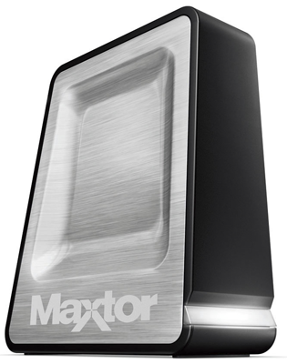
The Dvorak.org/home.htm webpage has been online for over 10 years and it’s time for a make-over. The site was originally set up as a text-only site for quick loading. It contains useful links that I myself use. The organization of the page has only been changed once and probably needs a serious face-lift/re-org. So I am offering a handy Maxtor portable hard disk as a prize – plus the publicity – for the best redesign of the page by anyone who wants to give it a shot.
Here is the basic criteria.
1. Quick loading.—The site was initially text only and designed to be easy loading and easy to put on the C:\ drive for even faster loading. This meant HTML and all text and no graphics. I would still prefer a faster loading page but times have changed a bit. While I do not want a slew of graphics, some might be acceptable. But if someone does a page with no graphics and it looks better it will get priority. The page is also table driven and clumsy. A smart CSS layout would be better and I’m thinking the CSS would be imbedded in the page itself although there may be more versatility if it is offset on another file.
2. Easy to edit – This means easy to edit for me, after the fact. I want to be able to quickly erase a link or change a link or add a link without blowing up the page or having too much hassle. If this requires a WYSIWYG editor – as it should – then I need to know which editor and whether the page will also work with other editors.
3. Attractive – the category will become the final arbiter you can be sure. I’d like to see something modern and attractive with good organization.
I know there is someone out there who has seen this homely page over the years and has already thought about how to make it look good.
The best design gets the hard disk. The best three designs get mentioned with whatever plug you want for yourself on the blog with thanks on one of my podcasts (of my choosing).
the prize

Stylish Maxtor One Touch 4 Mini 160 GB USB Drive
Review of drive here
contest ends Dec. 31
submit to john@dvorak.org and please use the subject line: HOMEPAGE CONTEST


Can it have JavaScript?
I ask because _real_ easy to edit would be something like this at the bottom of the page:
[div]
MEL – http://elibrary.mel.org/
CUSI – http://cusi.emnet.co.uk/
[/div]
And then the JavaScript sort it out. No WYSIWYG needed.
If it’s fast Javascript is fine…why not? There are no specific constraints.
remind me again…the competition is particularly open to who ?
I just returned for a refund a 500GB Maxtor OneTouch 4. Unused — just plugged in and left to sit — the drive would disappear from “My Computer” and show up under Disk Management as “Basic — Unreadable.” After a reboot, the drive would show up again normally and then croak a short time afterward, as described.
Maxtor has been in a declining-quality spiral for quite some time. After years of ridiculous 1-year warranties, Maxtor still doesn’t offer 5-year warranties for all of its drives. Seagate hasn’t yet turned them around.
Ironically, my USB OneTouch 4 had a 5-year warranty, BUT it would be invalidated if the drive failed and I popped open the craptastic plastic case to rescue the data via an IDE cable.
Look at what these OneTouch users are suffering on the Maxtor “Support” site:
Sorry, John, I wouldn’t walk across the street to buy you a cup of coffee, if a free Maxtor OneTouch were the incentive.
😉
Now, this must be cheaper than even hiring a bunch of Indian programmers. Work hard folks!! You might get that $100 HD…
Yeah Jägermeister. You may be right. But what is the exposure worth. I could only dream of getting the exposure that John gets on his site.
Whoever gets this gig gets exposure plex… and that’s priceless.
Hey… I would walk across the street to buy John a cup of coffee.
funny – this site is already super fast to load…
Seriously – use .SHTML with #includes for the different sections.
Depending on the hosting server, .SHTML offers some cool features like IP tracking and date & time functions.
Then the snippets, pure html, linked in by the server, and the “receiving client” gets a complete web page, built by the server.
Then depending on the IP address, you can determine the different search engine robots and feed them something else.
Depending on the client used, feed them something else.
The #IF directives are quite useful.
John has a homepage?
Who knew…
(As long as he doesn’t pick the same person that redesigned his blog we will be fine.)
Shall we “optimize” page width for a particular screen resolution?
Continuing on what I posted.
If say, there is a table in the .SHTML of three columns and 20 rows. That’s 60 sections.
We could put #include Row01_Col01.html through Row20_Col03.html for each cell.
Then any editor, I recommend Notepad++, to edit a particular html, change the links / text.
The added advantage is that the “home” .SHTML file can be outsourced to a graphic designer.
The designer will make a snazzy .HTML file, that you rename to .SHMTL, put the #includes everywhere.
If you need more rows, edit the .SHTML file, and add a TR + TD section.
The trick is that .SHTML is extremely light on the CPU of the server, doesn’t require any fancy programming, no MySql / Php.
Thus can be hosted anywhere! Including my fav, a WAMP.
#11 I always use a single TABLE at 100% with one row, one column.
Stick the entire page inside the cell, with width & height set to Center.
So every resizes nicely, between multiple browsers and screens.
Darn, you would have to pay me to use a Maxtor external drive for anything but a door stop.
Hey to the two dingalings. If you don’t like Maxtor, take it to some other forum. I have a couple of these drives and they work fine if set up correctly. It’s not the point of the idea! Nobody is making you code for a disk drive you do not like.
And yes, Wookie, the site does load super-fast. It’s just terribly dated. Did you actually follow any of what I wrote?
Finally I think 1024×786 would be a good width.
Oh come on… first the blog, now the home page. I’m betting it will end up as some crappy, wannabe web2.0 “live” page…
Wouldn’t be a bad idea for you to stop using that Macintosh John, it’s getting to you.
The blog needed to be changed since the RSS would not work with the new code base. The HOME page is seriously old and has needed work forever. It’s not a dynamic page, so I reckoned someone could crank it out rather than I myself making a new similarly ugly version. That said, it could be a dynamic page with a back-end to fill in to get the links on the final page. I dunno. Maybe nobody will do anything.
And maybe it will be an AJAX page..who knows?
Good luck John!
I think it’s about time for a change.
I think 1024 X 768 would be a good size.
sounds easy enough. do you want it to look similar to the way it looks now? Same color scheme? font? do you want the same links/content within it, or an updated version. should we just set it up so you can fill in the blanks? should it be completely re-organized, re-tooled, and look completely different?
sorry for so many questions, just want to make sure I do it right. I’ll see if I can get anything good…
Sorry to get off topic, but I am unable to use my ‘back’ button to go back to the Blog ‘topics’ from the Blog ‘comments’. I have been selecting the Dovorak Uncensored title tag and scrolling down to where I left off.
I’m not entering. But, John, why not use Joomla, the really cool open source constant management system. Works a lot like WordPress in terms of add ons and themes, and you got a good handle on that program.
Hey, old man, there’s no need to call us “dingalings” or suggest that we don’t know how to “use” (plug in the power and USB cords of) a factory-formatted Maxtor OneTouch. Have you ever considered that some of your readers have far more experience with Maxtor than you do?
With your substantial six-figure income, if you’re so cheap that the best you can do is offer a low-quality drive–the value of which would never be even close to the proper compensation you’d have to pay an American Web programmer–I suggest, as another reader pointed out, you outsource an Indian.
I’m sure that your world-traveling and cheapskate ideas have left you speaking perfect Hinglish.
I’m going to give it a try, because it offers some unique challenges. And I think anyone who’s passionate about computers/programming is always on the lookout for an interesting challenge.
Anyone bitching about the HDD is missing the point.
I bet you if John just asked everyone to create a home page for him without the prize there wouldn’t be so much bitching.
cripes. No comment on the HDD. You are right I should be giving away a Ferrari for a prize.
As for Joomla, I don’t really want to use a steamroller to kill an ant! Yikes. Note the “speed” requirement.
And relax (above) is right. The if there was no token prize there would be zero complaining. Incredible. And the people complaining would never enter anyway. It’s like the joke about the restaurant with the bad food with the punchline..”and the portions are so small!”
These are variations of the YOU SUCK post.
Also I am not suggesting colors or fonts or anything. I was hoping for something original.
Geez.. All the haters.
If you win a 10 mile marathon, and get a trophy, do you complain? Do you say, “Well, it took me 500 hours to prepare for that marathon, and I usually make $20 an hour. I think I deserve a little more than a $50 trophy!”
It’s a contest people. The cost of the prize doesn’t have to make up for the effort put in.
I’m sure John could have paid some college student $200 to make the page for him. But this is much more fun.
John,
Fix the blog. Its much worse now…
Loved it before…really…
Please fix the new one.
It badly needs to be centered, and the fonts are not good….
I’m visiting the blog much less often now
I understand you needed to change it for tech reason, but the job ain’t done…!
best wishes
Sean, Only because it has brought out a bunch of psychos. I think I’ll have to do more of this!
As for the current iteration of the blog I’ll make some changes shortly.
The net was interesting when it started, and the idea was MOST monitors were 800×600, and pages FIT on that. NOW we have 1024×768+ screens, and the NET has WIDENED to fit THAT…I liked it when I could display a few pages on screen. Every time I turn around they are making pages BIGGER, NOW I need WIDE SCREEN(reverse of Vertical display) and 3000x??? wide so I can read pages at same time.
As the screen size is going up, the FONT size is changing also..What is this 8pt fonts…12 pt was cool and easy to read. I thought many sites had RESIZE-ABLE formats..to adjust to what the USER had sized the page for..that was cool also. I could Widen it, and everything floated into position, and TXT got bigger or Spread.